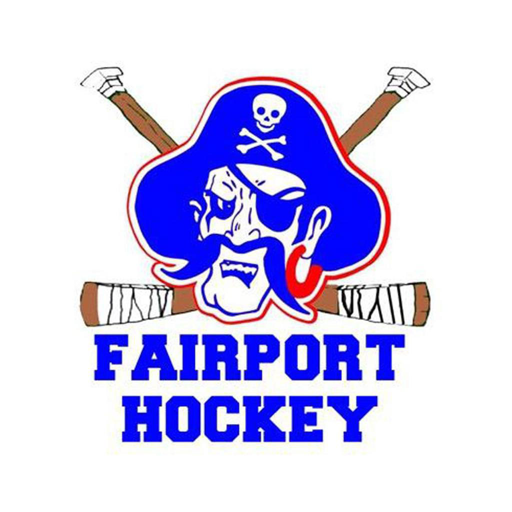
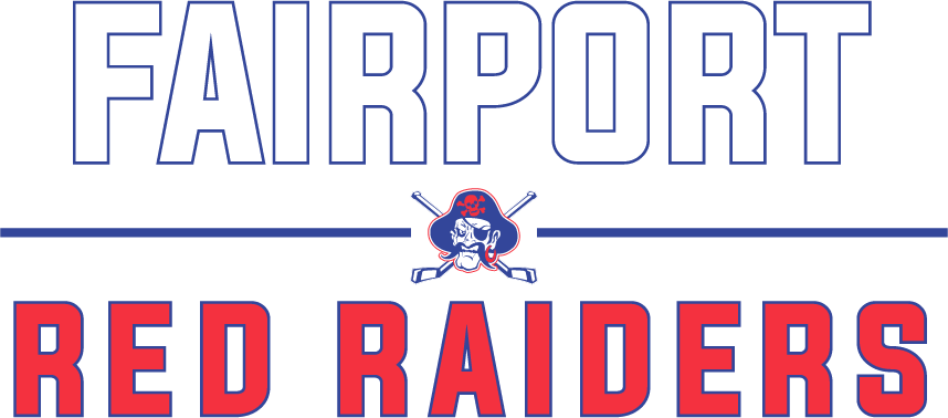
Fairport Hockey has used a modified version of the Fairport Red Raider logo since the early 1990s, but wanted to update the logo for their 2020-21 hockey season to fall in line with the modern Raider logo. The new design is meant to be a call back to the original inspiration, while fitting in with the rest of the branding the team uses.
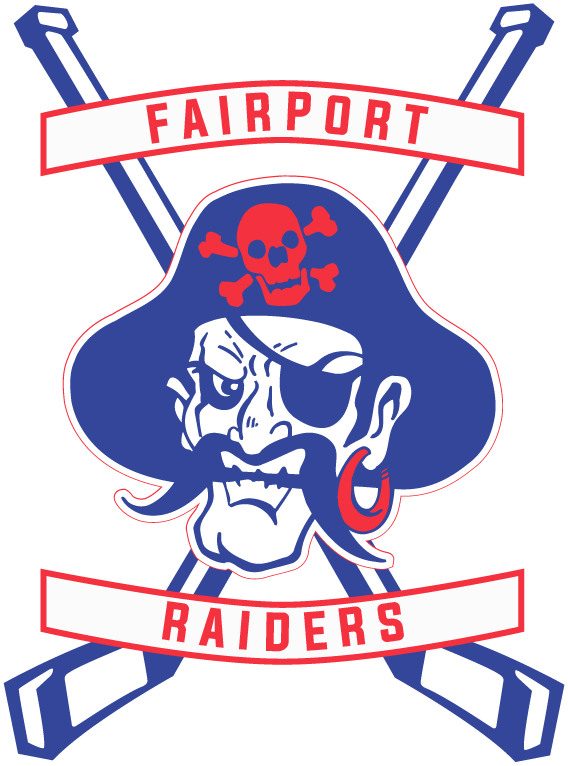
The original 1990s logo the team wanted to modernize
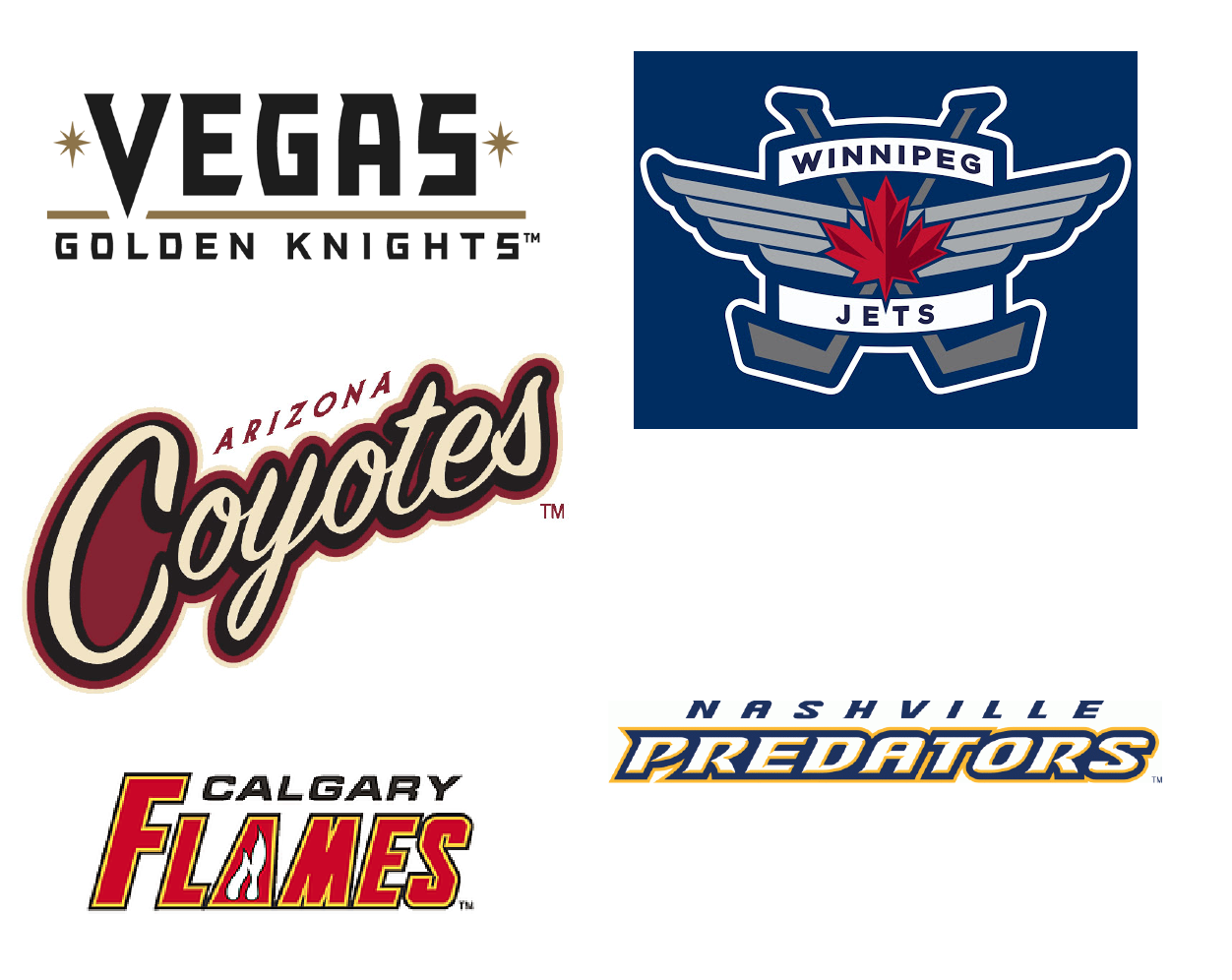
Logotype inspirations from current NHL designs
Exploration #1
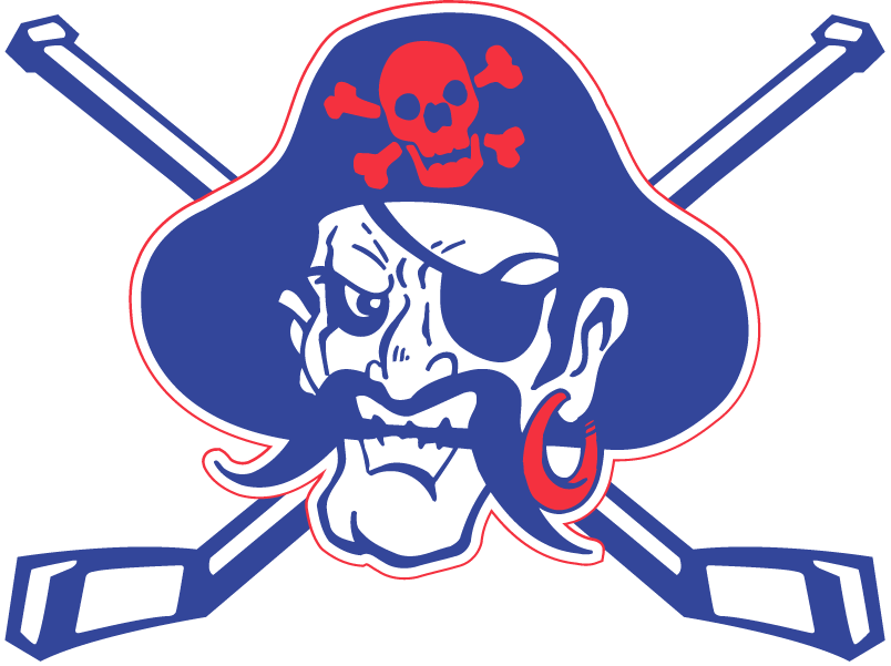
Exploration #2
Exploration #3
The team decided to keep the logo close to the original inspiration, as it was the easiest to adapt for team store clothing, jerseys, and marketing material for the season.
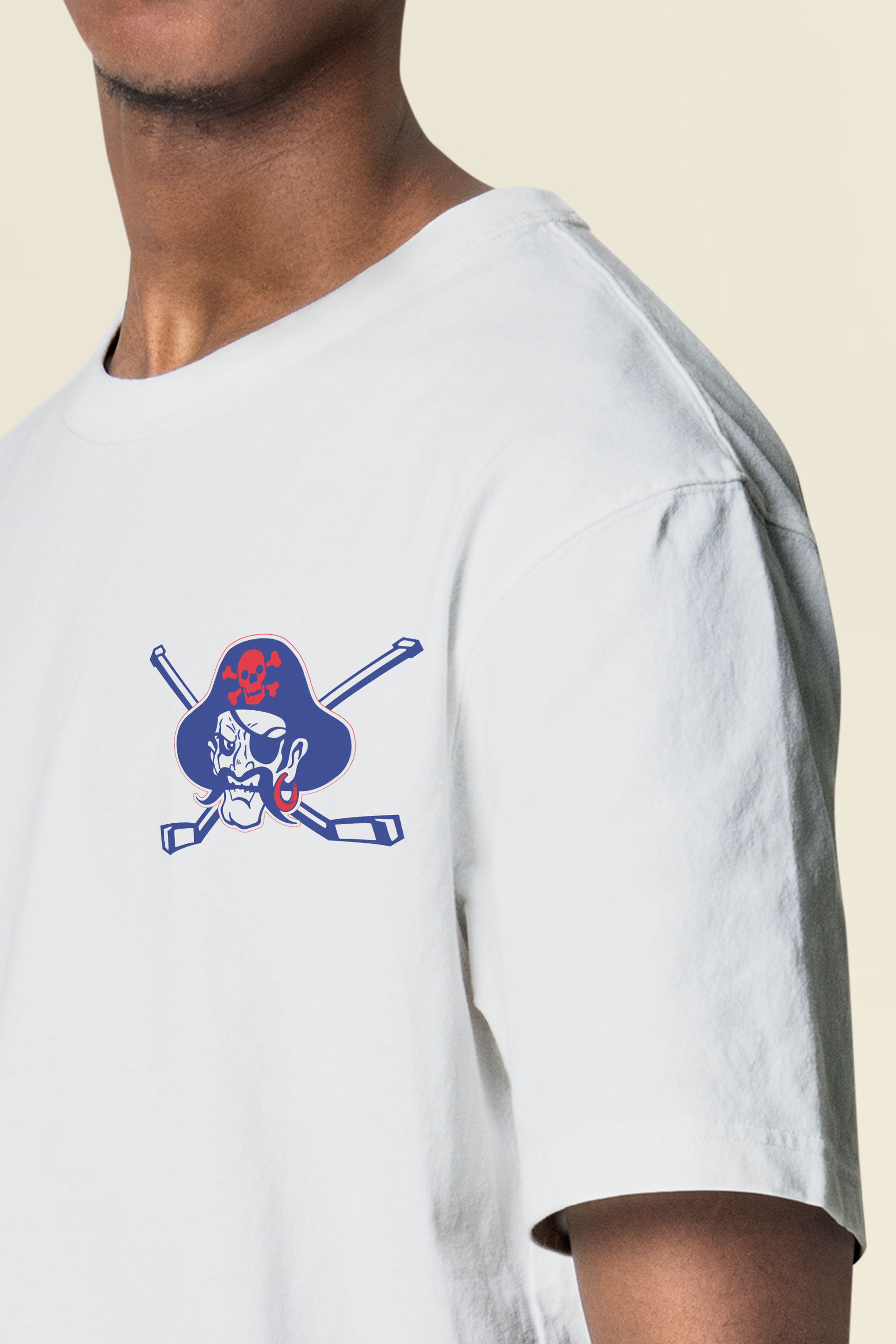
Plain T-shirt mockup
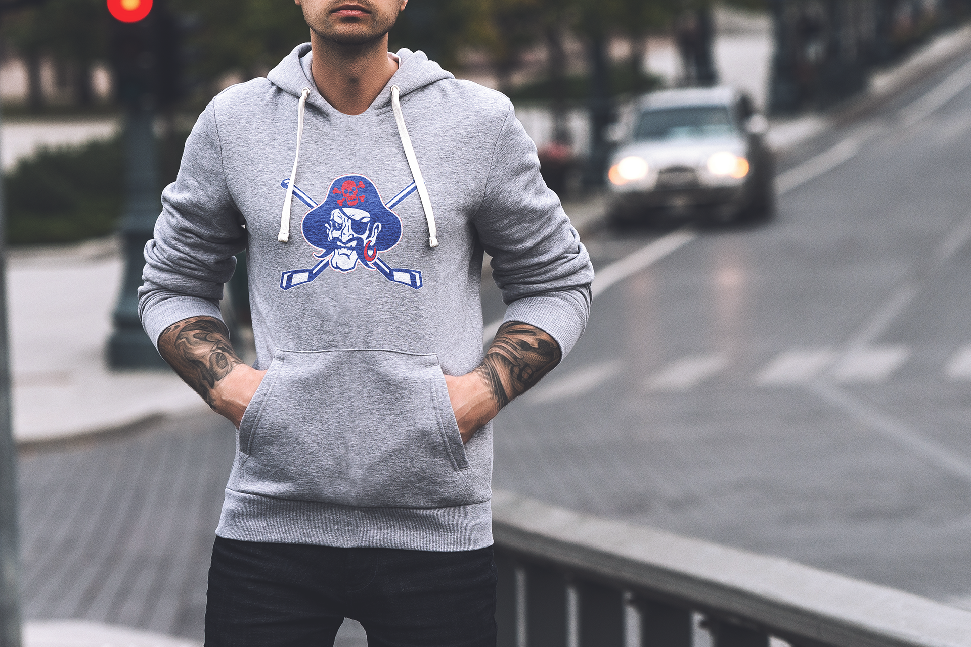
Hoodie mockup
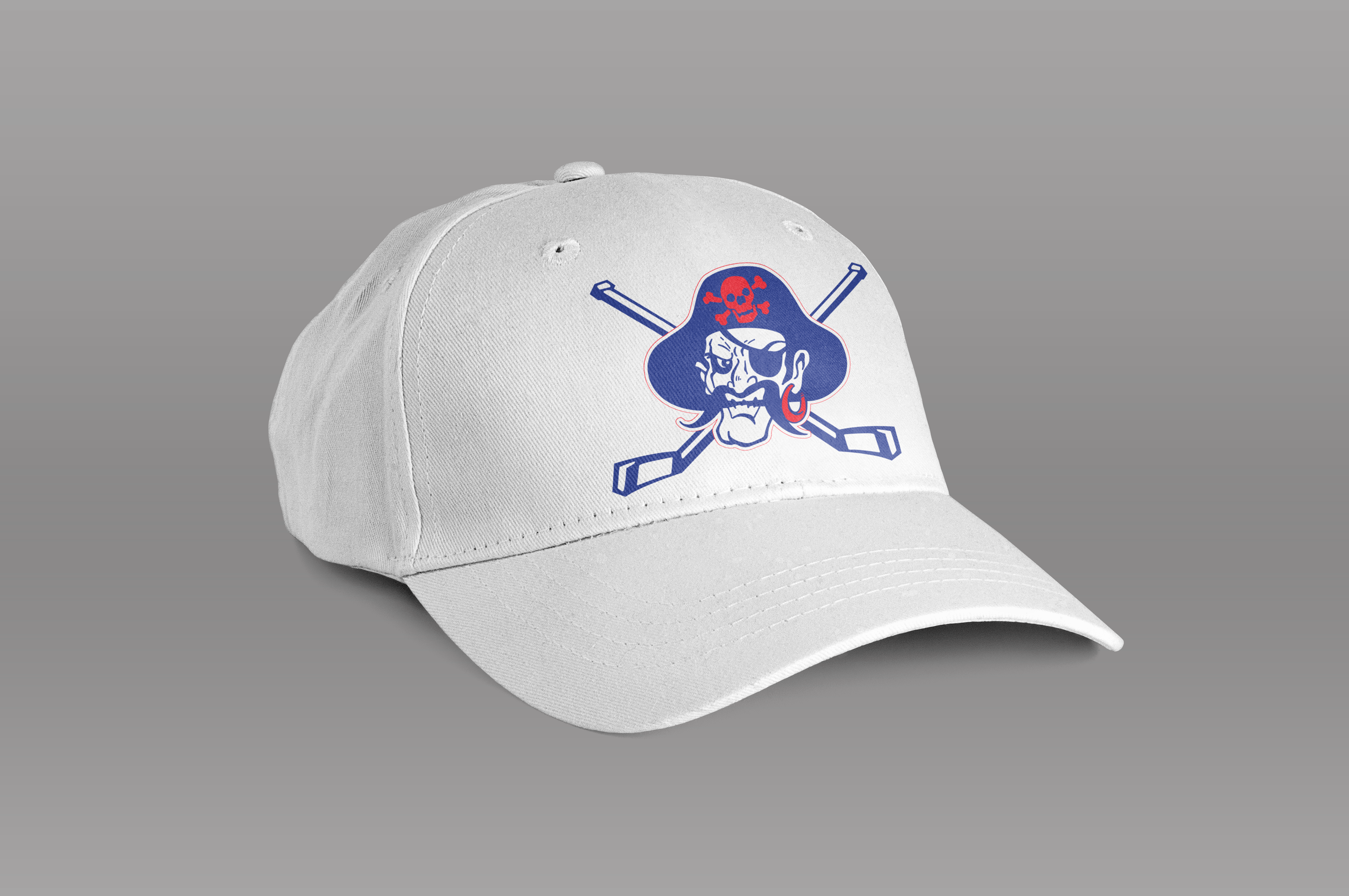
Plain white ball cap mockup